`charts.css.py` brings `charts.css` to Python. Online documentation and samples is available at the link below.

Overview

charts.css.py

charts.css.py provides a python API to convert your 2-dimension data lists into html snippet, which will be rendered into charts by CSS, when serving inside a browser.

  • The output of charts.css.py is not images. Consequently, charts.css.py is a pure Python package without any image library dependency. You can use charts.css.py on any platform.
  • The output of charts.css.py is a normal HTML table. Search engines and screen readers will be able to consume your data even when CSS rendering is unavailable.
  • Once the html snippet is delivered into the browser window, the rendering is done by CSS, which is typically faster than JS-heavy chart libraries.
  • Since the output is normal HTML, you could customize its size and position, by defining your own CSS styles.

Installation

pip install charts.css.py

Usage

Just combine the output of charts.css.py functions and the predefined CSS style <link rel="stylesheet" href="https://cdn.jsdelivr.net/npm/charts.css/dist/charts.min.css"> into your html page.

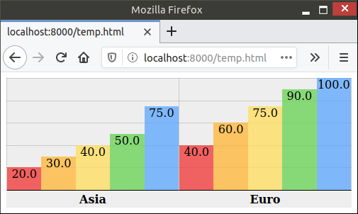
For example, the following code snippet can convert a 2-dimension list into column chart:

from charts.css import column
STYLESHEET = '<link rel="stylesheet" href="https://cdn.jsdelivr.net/npm/charts.css/dist/charts.min.css">'
chart = column(
    [
        ["Continent", "1st year", "2nd year", "3rd year", "4th year", "5th year"],
        ["Asia", 20.0, 30.0, 40.0, 50.0, 75.0],
        ["Euro", 40.0, 60.0, 75.0, 90.0, 100.0],
    ],
    headers_in_first_row=True,
    headers_in_first_column=True,
    )
# Now, variable chart contains html snippet of "<table>...</table>", and
# STYLESHEET is just a constant string of "<link href='https://.../charts.css'>".
# You can somehow insert them into the proper places of your full html page.
# Here in this sample, we take a shortcut by simply concatenating them.
open("output.html", "w").write(STYLESHEET + chart)

The output.html will be rendered in browser like this:

Sample output

Advanced Usage

There are currently 4 different charts implemented: bar, column, line, area. All those methods support many parameters to further customize the chart appearance. bar() and column() also support stacking by value or stacking by percentage. All those features are demonstrated in the different samples in this document.

Lastly, this package also provides a command-line tool csv2chart. You can use it to convert csv file into an html file. For example, csv2chart sample.csv output.html. You can also run csv2chart -h to know all the parameters it supports.

Versioning

charts.css.py uses Semantic Versioning.
You might also like...
🐞 📊 Ladybug extension to generate 2D charts

ladybug-charts Ladybug extension to generate 2D charts. Installation pip install ladybug-charts QuickStart import ladybug_charts API Documentation Loc

GitHub English Top Charts

Help you discover excellent English projects and get rid of the interference of other spoken language.

Data-FX is an addon for Blender (2.9) that allows for the visualization of data with different charts

Data-FX Data-FX is an addon for Blender (2.9) that allows for the visualization of data with different charts Currently, there are only 2 chart option

Glue is a python project to link visualizations of scientific datasets across many files.

Glue Glue is a python project to link visualizations of scientific datasets across many files. Click on the image for a quick demo: Features Interacti

Flipper Zero documentation repo

Flipper Zero Docs Participation To fix a bug or add something new to this repository, you need to open a pull-request. Also, on every page of the site

A tool for automatically generating 3D printable STLs from freely available lidar scan data.

mini-map-maker A tool for automatically generating 3D printable STLs from freely available lidar scan data. Screenshots Tutorial To use this script, g

A Python Binder that merge 2 files with any extension by creating a new python file and compiling it to exe which runs both payloads.

Update ! ANONFILE MIGHT NOT WORK ! About A Python Binder that merge 2 files with any extension by creating a new python file and compiling it to exe w

Debugging, monitoring and visualization for Python Machine Learning and Data Science

Welcome to TensorWatch TensorWatch is a debugging and visualization tool designed for data science, deep learning and reinforcement learning from Micr

Python module for drawing and rendering beautiful atoms and molecules using Blender.

Batoms is a Python package for editing and rendering atoms and molecules objects using blender. A Python interface that allows for automating workflows.

Comments
  • charts.css.py 0.4.0

    charts.css.py 0.4.0

    This release adds some helper and parameters to help you fine tune the chart appearance. They are especially useful when you attempt to render some csv data input with many rows.

    • Feature: A transpose(...) helper to flip your input data diagonally so that it swaps its x-axis and y-axis.
    • Feature: New parameter hide_label. It is useful when primary axis contains too many rows.
    • Feature: New parameter tooltip_builder which has a shape of lambda value="...", label="...": "...".
    • Feature: New parameter value_converter which typically will be assigned with either int or float.
    • Change: By default, data axes will no longer be shown. You can turn it back on by the new show_data_axes parameter.

    The online documentation will be updated to demonstrate these new features.

    opened by rayluo 0
  • Release 0.3.0

    Release 0.3.0

    • Line chart should not accept non-zero data_spacing or datasets_spacing. Now it would rightfully reject such an input.
    • Provide an online document/sample
    • Backport to Brython 3.7 and 3.8. The recommended Brython version is still its latest version, currently 3.9.
    opened by rayluo 0
  • charts.css.py 0.1.0

    charts.css.py 0.1.0

    The first release contains:

    • Basic functionality including bar, column, line and area
    • An experimental helper wrapper
    • Barely enough documentation in README.md
    • Also comes with a command-line tool csv2chart. I use it for my ad-hoc test. Let me know if you find it useful.
    opened by rayluo 0
Releases(0.4.0)
  • 0.4.0(Jun 27, 2021)

    This release adds some helper and parameters to help you fine tune the chart appearance. They are especially useful when you attempt to render some csv data input with many rows.

    • Feature: A transpose(...) helper to flip your input data diagonally so that it swaps its x-axis and y-axis.
    • Feature: New parameter value_converter which typically will be assigned with either int or float. With its help, now you can consume data directly from csv by data = list(csv.reader(f)).
    • Feature: New parameter hide_label. It is useful when primary axis contains too many rows.
    • Feature: New parameter tooltip_builder which has a shape of lambda value="...", label="...": "...".
    • Change: By default, data axes will no longer be shown. You can turn it back on by the new show_data_axes parameter.

    The online documentation ~will be~ has been updated to demonstrate these new features.

    Source code(tar.gz)
    Source code(zip)
    charts.css.py-brython.js(8.11 KB)
  • 0.3.0(May 23, 2021)

    • Line chart should not accept non-zero data_spacing or datasets_spacing. Now it would rightfully reject such an input.
    • Provide an online document/sample
    • Backport to Brython 3.7 and 3.8. The recommended Brython version is still its latest version, currently 3.9.
    • Also hosted as a Brython package which can be used by <script src="https://github.com/rayluo/charts.css.py/releases/download/0.3.0/charts.css.py-brython.js"></script>. Requires Brython 3.7.5 or above.
    Source code(tar.gz)
    Source code(zip)
    charts.css.py-brython.js(7.20 KB)
  • 0.2.0(May 17, 2021)

  • 0.1.0(May 14, 2021)

    The first release contains:

    • Basic functionality including bar, column, line and area
    • An experimental helper wrapper
    • Barely enough documentation in README.md
    • Also comes with a command-line tool csv2chart. I use it for my ad-hoc test. Let me know if you find it useful.
    Source code(tar.gz)
    Source code(zip)
erdantic is a simple tool for drawing entity relationship diagrams (ERDs) for Python data model classes

erdantic is a simple tool for drawing entity relationship diagrams (ERDs) for Python data model classes. Diagrams are rendered using the venerable Graphviz library.

DrivenData 129 Jan 04, 2023
Generate "Jupiter" plots for circular genomes

jupiter Generate "Jupiter" plots for circular genomes Description Python scripts to generate plots from ViennaRNA output. Written in "pidgin" python w

Robert Edgar 2 Nov 29, 2021
A curated list of awesome Dash (plotly) resources

Awesome Dash A curated list of awesome Dash (plotly) resources Dash is a productive Python framework for building web applications. Written on top of

Luke Singham 1.7k Dec 26, 2022
Datapane is the easiest way to create data science reports from Python.

Datapane Teams | Documentation | API Docs | Changelog | Twitter | Blog Share interactive plots and data in 3 lines of Python. Datapane is a Python lib

Datapane 744 Jan 06, 2023
Because trello only have payed options to generate a RunUp chart, this solves that!

Trello Runup Chart Generator The basic concept of the project is that Corello is pay-to-use and want to use Trello To-Do/Doing/Done automation with gi

Rômulo Schiavon 1 Dec 21, 2021
A collection of 100 Deep Learning images and visualizations

A collection of Deep Learning images and visualizations. The project has been developed by the AI Summer team and currently contains almost 100 images.

AI Summer 65 Sep 12, 2022
Manim is an animation engine for explanatory math videos.

A community-maintained Python framework for creating mathematical animations.

12.4k Dec 30, 2022
PanGraphViewer -- show panenome graph in an easy way

PanGraphViewer -- show panenome graph in an easy way Table of Contents Versions and dependences Desktop-based panGraphViewer Library installation for

16 Dec 17, 2022
Pglive - Pglive package adds support for thread-safe live plotting to pyqtgraph

Live pyqtgraph plot Pglive package adds support for thread-safe live plotting to

Martin Domaracký 15 Dec 10, 2022
YOPO is an interactive dashboard which generates various standard plots.

YOPO is an interactive dashboard which generates various standard plots.you can create various graphs and charts with a click of a button. This tool uses Dash and Flask in backend.

ADARSH C 38 Dec 20, 2022
Fast scatter density plots for Matplotlib

About Plotting millions of points can be slow. Real slow... 😴 So why not use density maps? ⚡ The mpl-scatter-density mini-package provides functional

Thomas Robitaille 473 Dec 12, 2022
Bcc2telegraf: An integration that sends ebpf-based bcc histogram metrics to telegraf daemon

bcc2telegraf bcc2telegraf is an integration that sends ebpf-based bcc histogram

Peter Bobrov 2 Feb 17, 2022
Focus on Algorithm Design, Not on Data Wrangling

The dataTap Python library is the primary interface for using dataTap's rich data management tools. Create datasets, stream annotations, and analyze model performance all with one library.

Zensors 37 Nov 25, 2022
Matplotlib colormaps from the yt project !

cmyt Matplotlib colormaps from the yt project ! Colormaps overview The following colormaps, as well as their respective reversed (*_r) versions are av

The yt project 5 Sep 16, 2022
Param: Make your Python code clearer and more reliable by declaring Parameters

Param Param is a library providing Parameters: Python attributes extended to have features such as type and range checking, dynamically generated valu

HoloViz 304 Jan 07, 2023
termplotlib is a Python library for all your terminal plotting needs.

termplotlib termplotlib is a Python library for all your terminal plotting needs. It aims to work like matplotlib. Line plots For line plots, termplot

Nico Schlömer 553 Dec 30, 2022
Tools for exploratory data analysis in Python

Dora Exploratory data analysis toolkit for Python. Contents Summary Setup Usage Reading Data & Configuration Cleaning Feature Selection & Extraction V

Nathan Epstein 599 Dec 25, 2022
A simple code for plotting figure, colorbar, and cropping with python

Python Plotting Tools This repository provides a python code to generate figures (e.g., curves and barcharts) that can be used in the paper to show th

Guanying Chen 134 Jan 02, 2023
The interactive graphing library for Python (includes Plotly Express) :sparkles:

plotly.py Latest Release User forum PyPI Downloads License Data Science Workspaces Our recommended IDE for Plotly’s Python graphing library is Dash En

Plotly 12.7k Jan 05, 2023
Plot and save the ground truth and predicted results of human 3.6 M and CMU mocap dataset.

Visualization-of-Human3.6M-Dataset Plot and save the ground truth and predicted results of human 3.6 M and CMU mocap dataset. human-motion-prediction

Gaurav Kumar Yadav 5 Nov 18, 2022