skunk 


Insert SVGs into matplotlib
pip install skunk
Jupyter Notebooks
To show generated SVGs in Jupyter Notebooks: Currently, axes are cutoff when viewed in jupyter - I think due to restrictive viewport. Save to file to get publication ready version
skunk.display(svg)
Overwrite Subplot
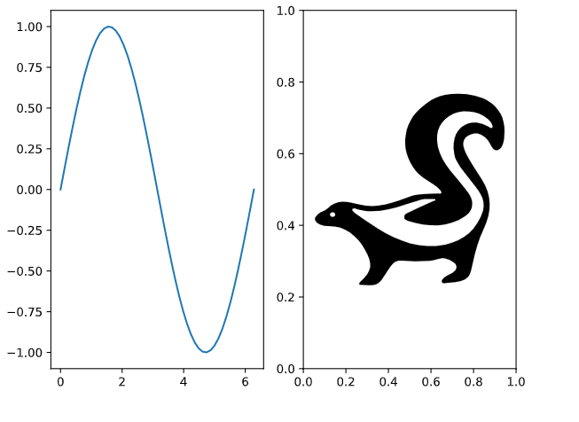
import skunk
import numpy as np
import os
import matplotlib.pyplot as plt

fig, axs = plt.subplots(ncols=2)

x = np.linspace(0, 2 * np.pi)
axs[0].plot(x, np.sin(x))

# important line where we set ID
skunk.connect(axs[1], 'sk')

plt.tight_layout()

# Overwrite using file path to my svg
# Can also use string
svg = skunk.insert(
    {
        'sk': 'skunk.svg'
    })

with open('replaced.svg', 'w') as f:
    f.write(svg)
Output
SVG in Annotation
Read about annotation boxes first
"))
ax.add_artist(ab)
# sknunk box with id sk2
box = skunk.Box(50, 50, 'sk2')
ab = AnnotationBbox(box, (3 * np.pi / 2, -1),
xybox=(-5, 100),
xycoords='data',
boxcoords='offset points',
arrowprops=dict(arrowstyle="->"))
ax.add_artist(ab)
# insert current figure into itself at sk1
# insert svg file in sk2
svg = skunk.insert(
{
'sk1': skunk.pltsvg(),
'sk2': 'skunk.svg'
})
with open('replaced2.svg', 'w') as f:
f.write(svg)
">
import numpy as np

fig, ax = plt.subplots()

x = np.linspace(0, 2 * np.pi)
ax.plot(x, np.sin(x))

# new code: using skunk box with id sk1
box = skunk.Box(50, 50, 'sk1')
ab = AnnotationBbox(box, (np.pi / 2, 1),
                    xybox=(-5, -100),
                    xycoords='data',
                    boxcoords='offset points',
                    arrowprops=dict(arrowstyle="->"))
ax.add_artist(ab)

# sknunk box with id sk2
box = skunk.Box(50, 50, 'sk2')
ab = AnnotationBbox(box, (3 * np.pi / 2, -1),
                    xybox=(-5, 100),
                    xycoords='data',
                    boxcoords='offset points',
                    arrowprops=dict(arrowstyle="->"))

ax.add_artist(ab)

# insert current figure into itself at sk1
# insert svg file in sk2
svg = skunk.insert(
    {
        'sk1': skunk.pltsvg(),
        'sk2': 'skunk.svg'
    })

with open('replaced2.svg', 'w') as f:
    f.write(svg)
Output

 13.1k Feb 18, 2021
 8.1k Feb 18, 2021

 391 Feb 17, 2021

 317 Feb 17, 2021

 356 Feb 16, 2021
 1.6k Jan 6, 2023
 207 Dec 8, 2022

 24 Jan 2, 2023


 519 Dec 30, 2022
 17 Dec 18, 2022
 1.7k Jan 07, 2023
 62 Dec 07, 2022
 0 Jun 25, 2022
 1 Nov 04, 2021
 67 Dec 28, 2022
 3 Aug 06, 2021
 107 Dec 26, 2022
 258 Nov 22, 2022
 2.4k Jan 04, 2023
 3 Dec 25, 2021
 3 Dec 13, 2022
 2 Jan 07, 2023
 0 Sep 12, 2021
 1 Sep 28, 2021
 46 Sep 18, 2022
 7 Feb 23, 2022
 149 Dec 29, 2022
 2 Jan 22, 2022