Announcement
Thank you to everyone who has used prettyplotlib and made it what it is today! Unfortunately, I no longer have the bandwidth to maintain prettyplotlib. I recommend using seaborn. Using seaborn, to get the prettyplotlib style, do:
import seaborn as sns
sns.set(style='ticks', palette='Set2')
And to remove "chartjunk", do:
sns.despine()
If you have discrete pull requests, I will accept them, but I personally will no longer fix bugs.
If you are a biological scientist looking for ways to analyze your big-ish (20+ samples) data, check out my main project, flotilla.

prettyplotlib
Python matplotlib-enhancer library which painlessly creates beautiful default matplotlib plots. Inspired by Edward Tufte's work on information design and Cynthia Brewer's work on color perception.
I truly believe that scientific progress is impeded when improper data visualizations are used. I spent a lot of time tweaking my figures to make them more understandable, and realized the scientific world could be a better place if the default parameters for plotting libraries followed recent advances in information design research. And thus prettyplotlib was born.
Requirements:
matplotlib. Can be installed viapip install matplotliboreasy_install matplotlibbrewer2mpl. Can be installed viapip install brewer2mploreasy_install brewer2mpl
Comparison to matplotlib
matplotlib default plot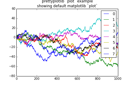 |
prettyplotlib default plot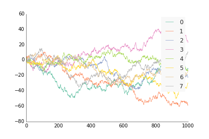 |
matplotlib default scatter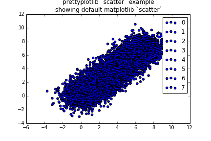 |
prettyplotlib default scatter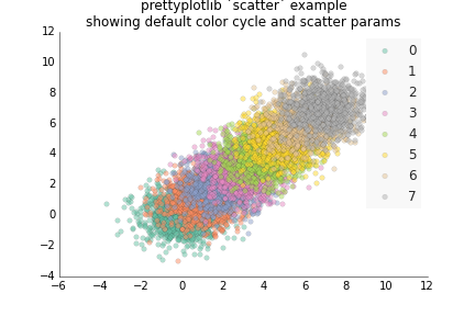 |
matplotlib default bar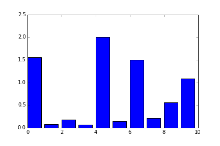 |
prettyplotlib default bar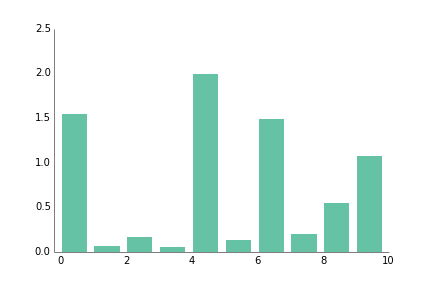 |
matplotlib default hist |
prettyplotlib default hist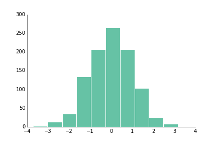 |
matplotlib default histwith grid 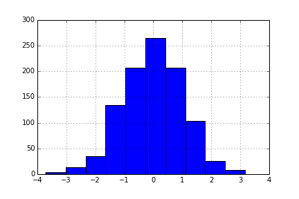 |
prettyplotlib default histwith grid  |
matplotlib default boxplot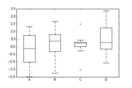 |
prettyplotlib default boxplot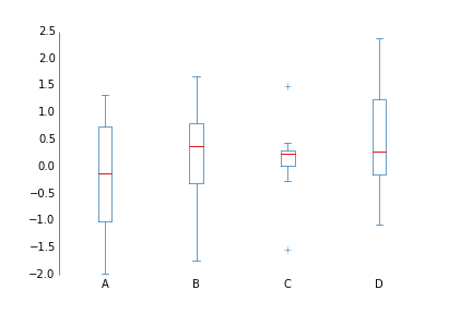 |
matplotlib default pcolormeshpositive and negative data 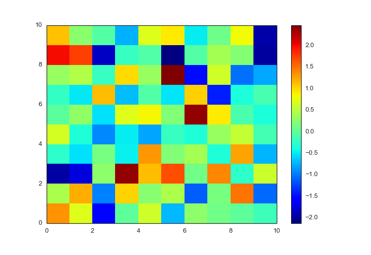 |
prettyplotlib default pcolormeshpositive and negative data 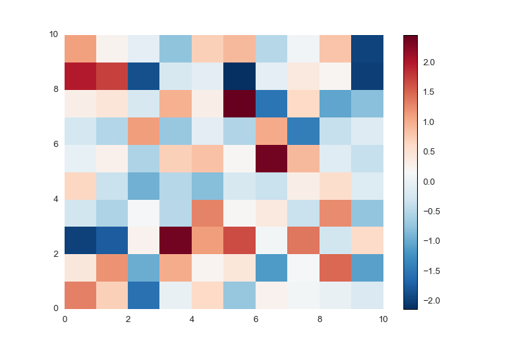 |
matplotlib default pcolormeshpositive data only 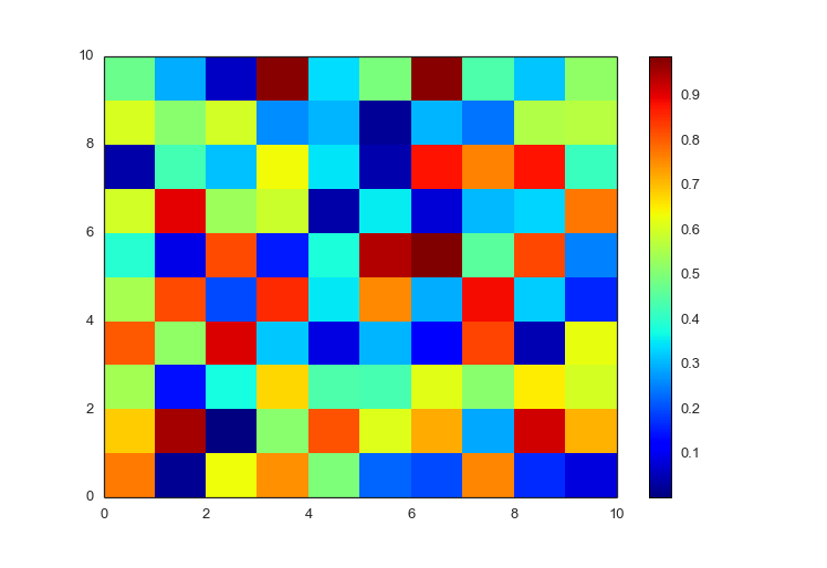 |
prettyplotlib default pcolormeshpositive data only 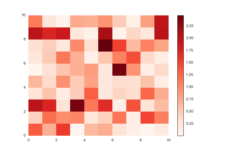 |
matplotlib pcolormeshnegative-valued data with labels 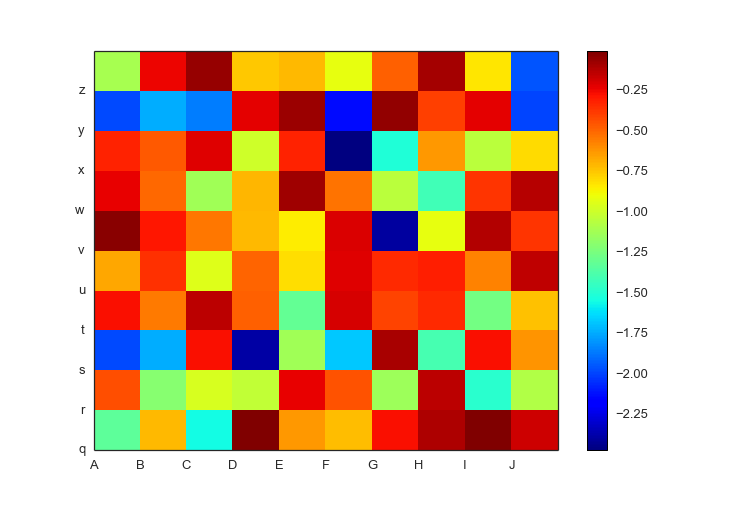 |
prettyplotlib pcolormeshnegative-valued data with labels 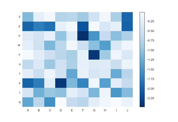 |
Quotes
"Dis ain't no uglyplotlib" - Anonymous

 9.2k Dec 30, 2022
 1k Jan 01, 2023
 1.8k Dec 31, 2022
 5 Feb 06, 2022
 38 Dec 20, 2022
 15 Nov 22, 2022
 7 Jul 06, 2022
 1.4k Dec 28, 2022
 2.7k Dec 30, 2022
 973 Jan 09, 2023
 98 Sep 24, 2022
 1 Nov 04, 2021
 12 Oct 20, 2022
 27 Nov 24, 2022
 5 Oct 28, 2021
 35 Dec 29, 2022
 504 Dec 15, 2022
 185 Dec 31, 2022
 2 Jun 15, 2021
 5.1k Dec 27, 2022