
pyecharts
Python


📣
简介
Apache ECharts (incubating) 是一个由百度开源的数据可视化,凭借着良好的交互性,精巧的图表设计,得到了众多开发者的认可。而 Python 是一门富有表达力的语言,很适合用于数据处理。当数据分析遇上数据可视化时,pyecharts 诞生了。
✨
特性
- 简洁的 API 设计,使用如丝滑般流畅,支持链式调用
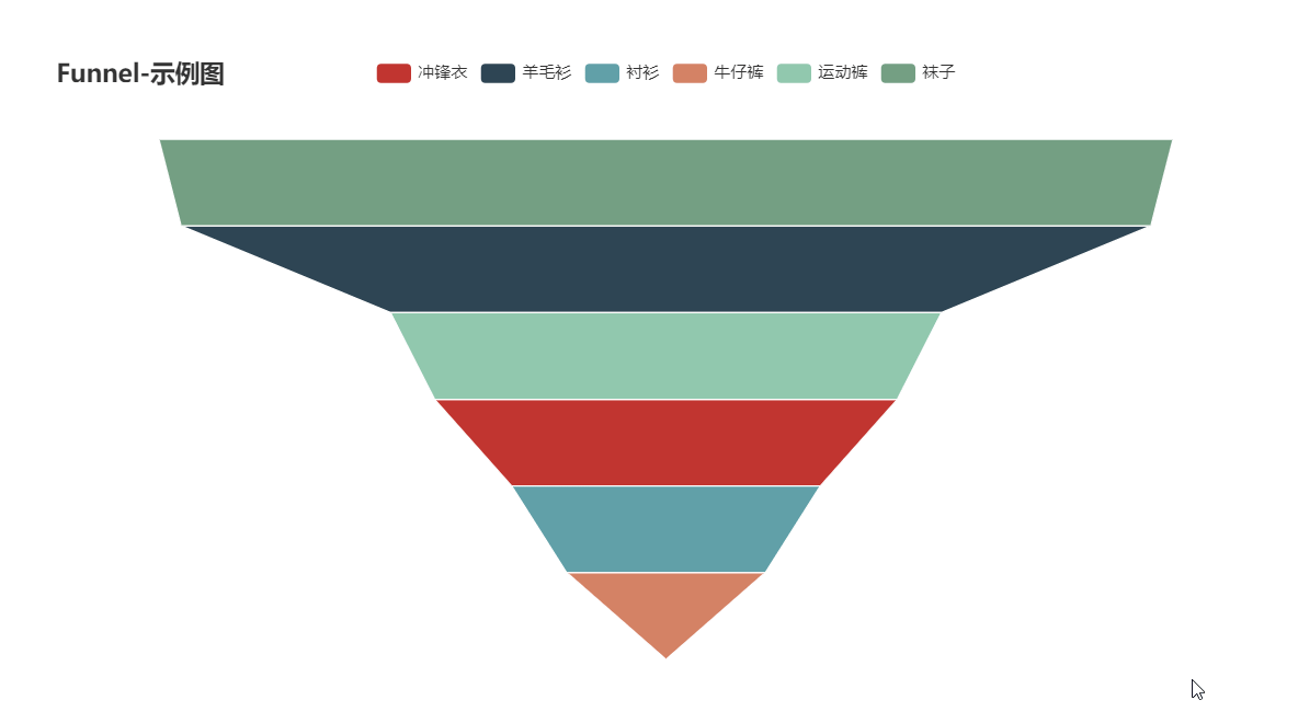
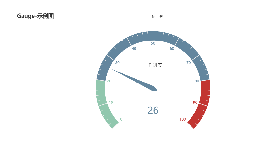
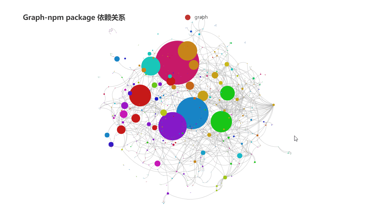
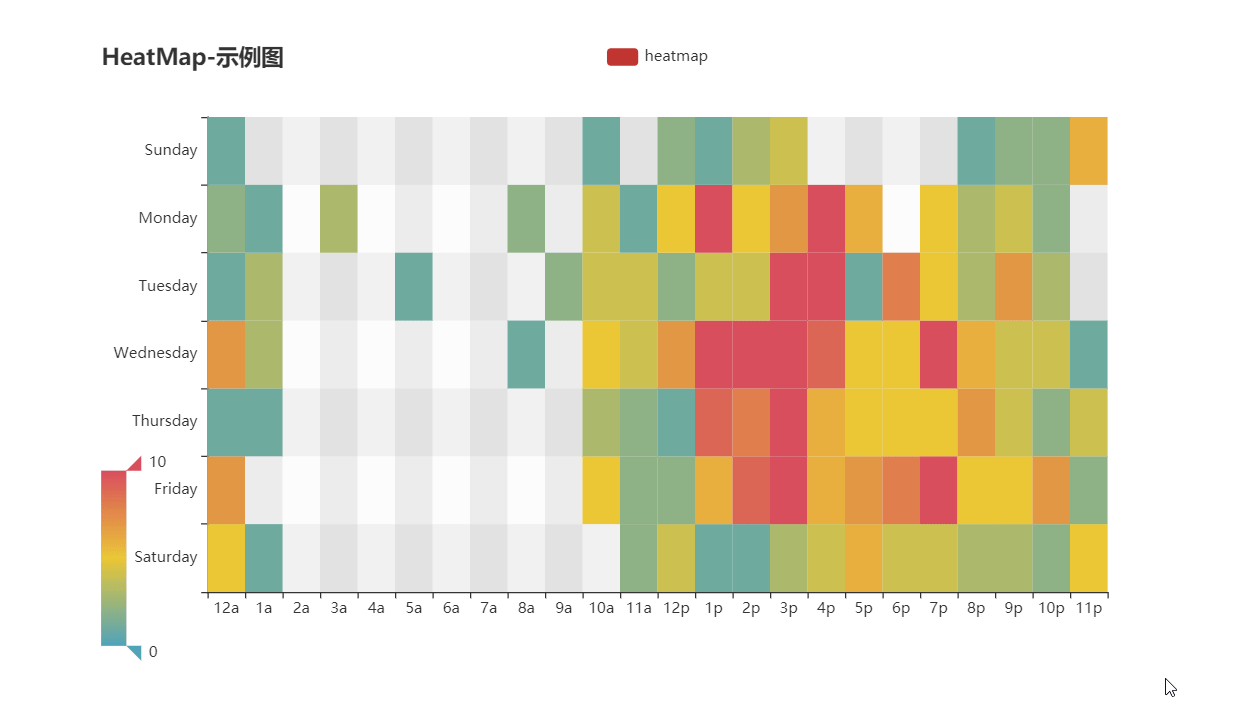
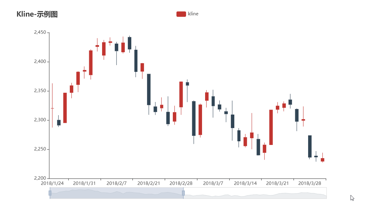
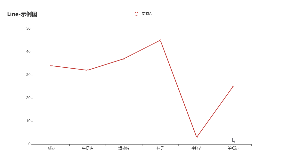
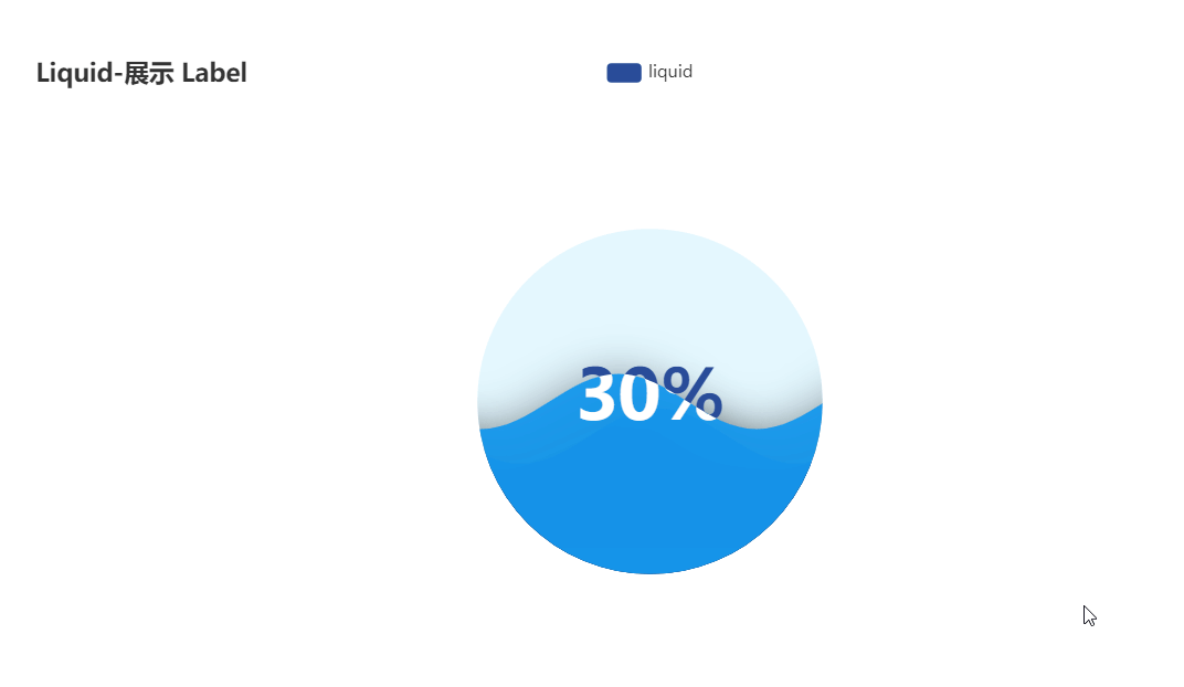
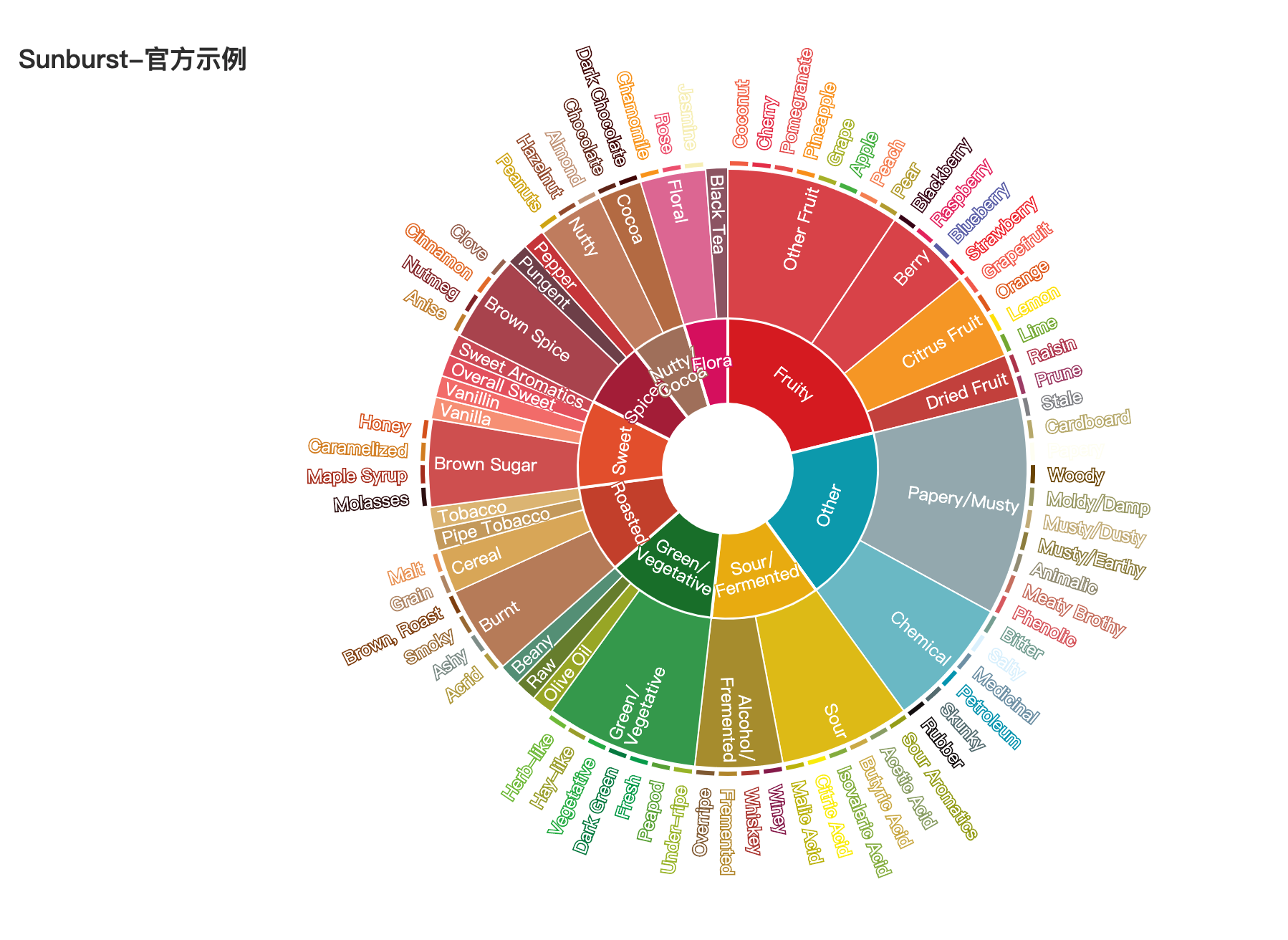
- 囊括了 30+ 种常见图表,应有尽有
- 支持主流 Notebook 环境,Jupyter Notebook 和 JupyterLab
- 可轻松集成至 Flask,Sanic,Django 等主流 Web 框架
- 高度灵活的配置项,可轻松搭配出精美的图表
- 详细的文档和示例,帮助开发者更快的上手项目
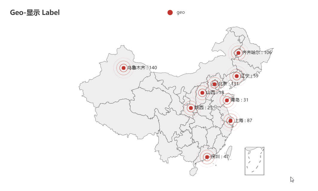
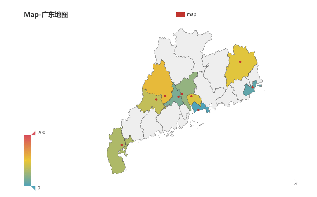
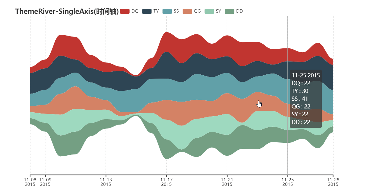
- 多达 400+ 地图文件,并且支持原生百度地图,为地理数据可视化提供强有力的支持
⏳
版本
v0.5.x 和 V1 间不兼容,V1 是一个全新的版本,详见 ISSUE#892,ISSUE#1033。
V0.5.x
支持 Python2.7,3.4+
经开发团队决定,0.5.x 版本将不再进行维护,0.5.x 版本代码位于 05x 分支,文档位于 05x-docs.pyecharts.org。
V1
仅支持 Python3.6+
新版本系列将从 v1.0.0 开始,文档位于 pyecharts.org;示例位于 gallery.pyecharts.org
🔰
安装
pip 安装
# 安装 v1 以上版本
$ pip install pyecharts -U

# 如果需要安装 0.5.11 版本的开发者,可以使用
# pip install pyecharts==0.5.11
源码安装
# 安装 v1 以上版本
$ git clone https://github.com/pyecharts/pyecharts.git
# 如果需要安装 0.5.11 版本,请使用 git clone https://github.com/pyecharts/pyecharts.git -b v05x
$ cd pyecharts
$ pip install -r requirements.txt
$ python setup.py install
📝
使用
本地环境
生成 HTML
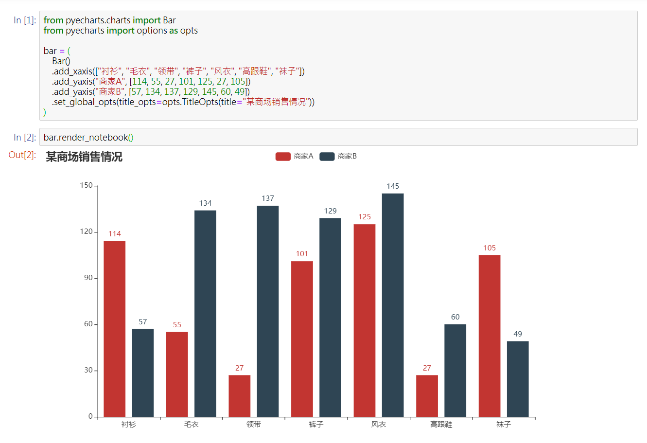
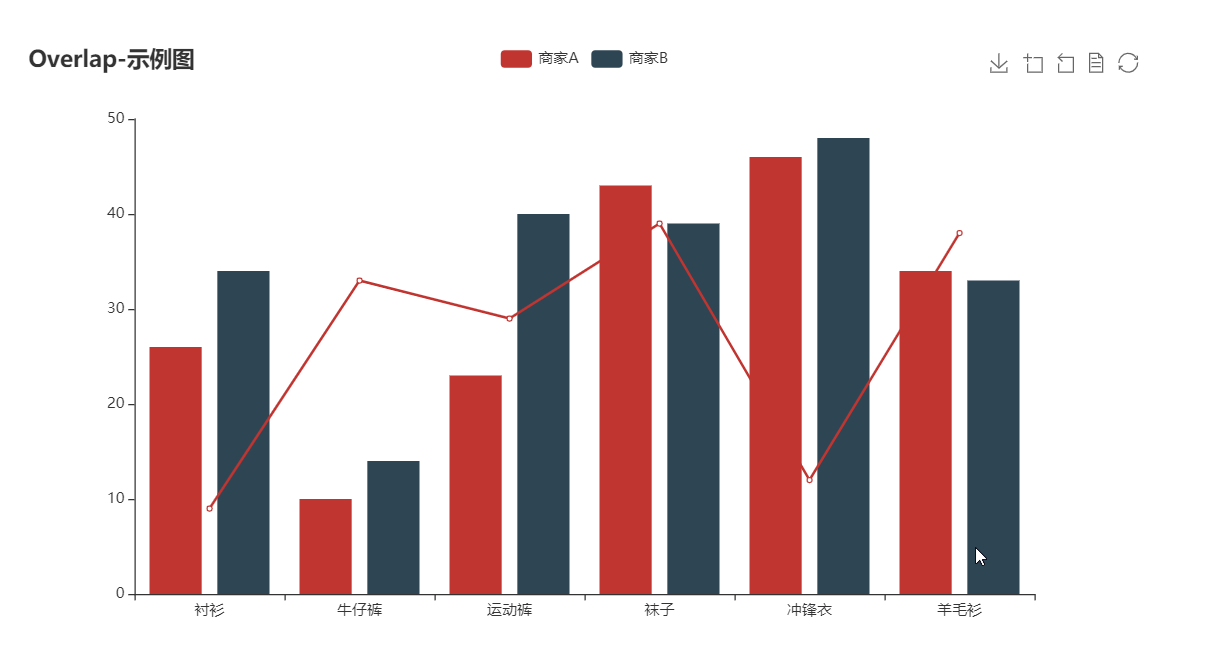
from pyecharts.charts import Bar
from pyecharts import options as opts
# V1 版本开始支持链式调用
bar = (
Bar()
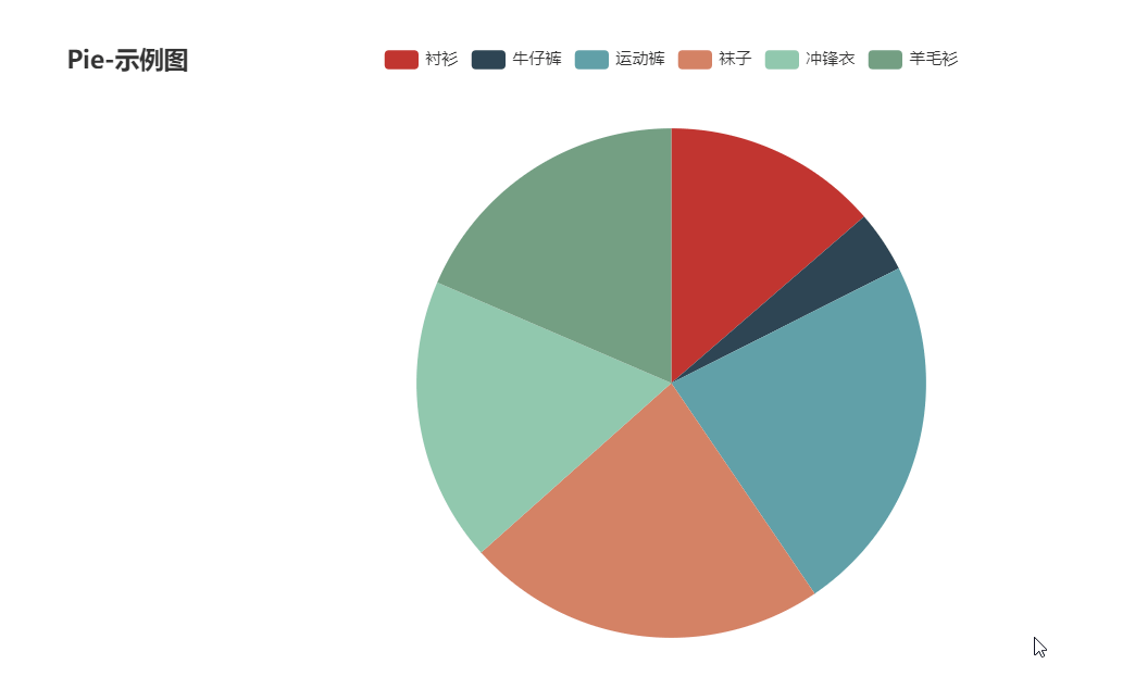
.add_xaxis(["衬衫", "毛衣", "领带", "裤子", "风衣", "高跟鞋", "袜子"])
.add_yaxis("商家A", [114, 55, 27, 101, 125, 27, 105])
.add_yaxis("商家B", [57, 134, 137, 129, 145, 60, 49])
.set_global_opts(title_opts=opts.TitleOpts(title="某商场销售情况"))
)
bar.render()
# 不习惯链式调用的开发者依旧可以单独调用方法
bar = Bar()
bar.add_xaxis(["衬衫", "毛衣", "领带", "裤子", "风衣", "高跟鞋", "袜子"])
bar.add_yaxis("商家A", [114, 55, 27, 101, 125, 27, 105])
bar.add_yaxis("商家B", [57, 134, 137, 129, 145, 60, 49])
bar.set_global_opts(title_opts=opts.TitleOpts(title="某商场销售情况"))
bar.render()

生成图片
from snapshot_selenium import snapshot as driver

from pyecharts import options as opts
from pyecharts.charts import Bar
from pyecharts.render import make_snapshot


def bar_chart() -> Bar:
    c = (
        Bar()
        .add_xaxis(["衬衫", "毛衣", "领带", "裤子", "风衣", "高跟鞋", "袜子"])
        .add_yaxis("商家A", [114, 55, 27, 101, 125, 27, 105])
        .add_yaxis("商家B", [57, 134, 137, 129, 145, 60, 49])
        .reversal_axis()
        .set_series_opts(label_opts=opts.LabelOpts(position="right"))
        .set_global_opts(title_opts=opts.TitleOpts(title="Bar-测试渲染图片"))
    )
    return c

# 需要安装 snapshot-selenium 或者 snapshot-phantomjs
make_snapshot(driver, bar_chart().render(), "bar.png")

Notebook 环境
Jupyter Notebook
JupyterLab

Web 框架

🔖
Demo
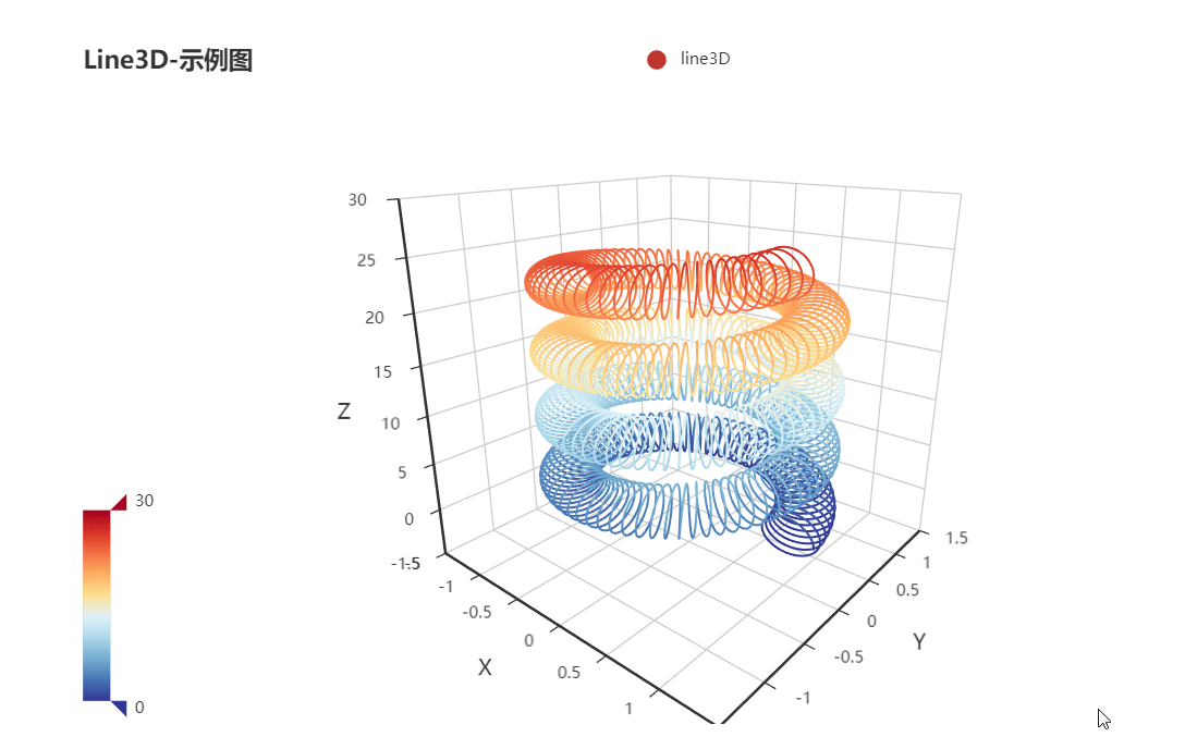
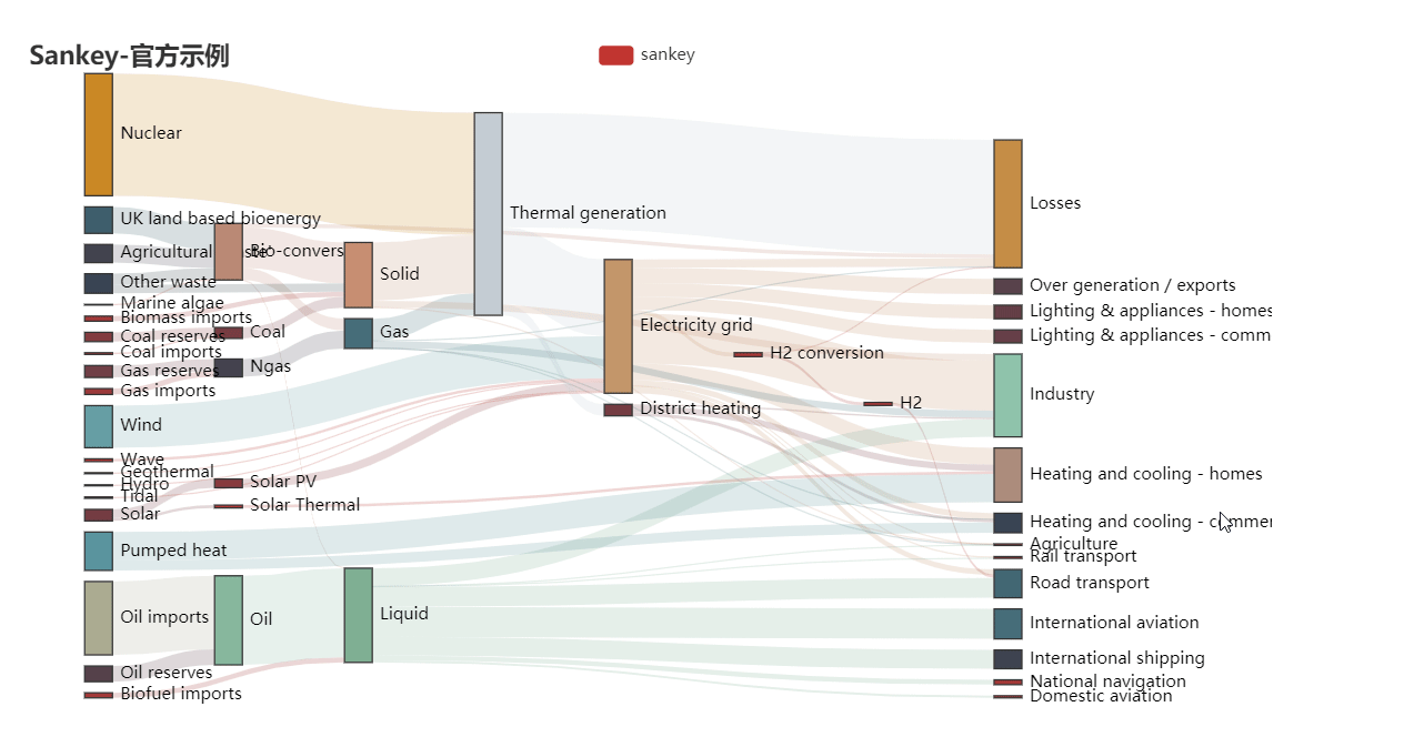
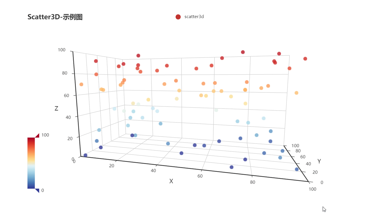
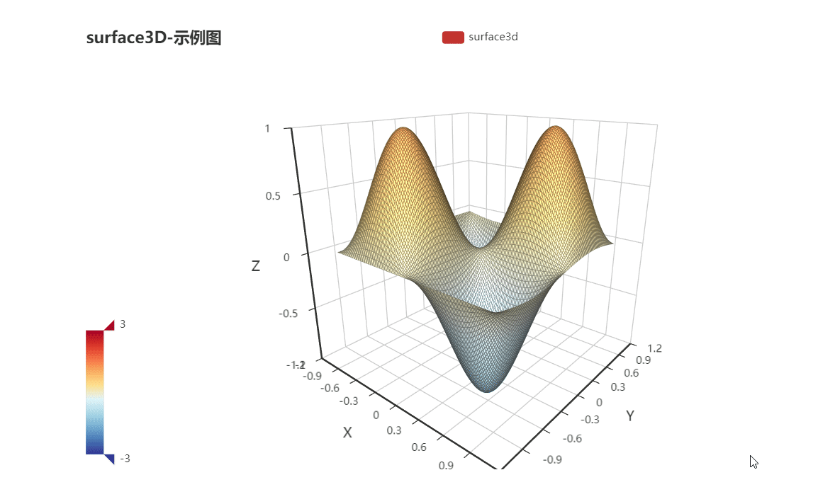
Demo 代码位于 example 文件夹下,欢迎参考 pyecharts 画廊 pyecharts-gallery。


更多详细文档,请访问
⛏
代码质量
单元测试
$ pip install -r test/requirements.txt
$ make
集成测试
使用 Travis CI 和 AppVeyor 持续集成环境。
代码规范
使用 flake8, Codecov 以及 pylint 提升代码质量。
😉
Author
pyecharts 主要由以下几位开发者开发维护
更多贡献者信息可以访问 pyecharts/graphs/contributors
💌
捐赠
开发和维护 pyecharts 花费了我巨大的心力,如果你觉得项目帮助到您,请认真考虑请作者喝一杯咖啡
| 微信二维码 | 支付宝二维码 |
|---|---|
 |
 |
如果其他开发者帮助到了您,也可以请他们喝咖啡 捐赠通道
💡
贡献
期待能有更多的开发者参与到 pyecharts 的开发中来,我们会保证尽快 Reivew PR 并且及时回复。但提交 PR 请确保
- 通过所有单元测试,如若是新功能,请为其新增单元测试
- 遵守开发规范,使用 black 以及 isort 格式化代码($ pip install -r requirements-dev.txt)
- 如若需要,请更新相对应的文档
我们也非常欢迎开发者能为 pyecharts 提供更多的示例,共同来完善文档,文档项目位于 pyecharts/website
📃
License
MIT ©chenjiandongx

 1.4k Dec 15, 2022
 9 Jul 22, 2022
 3k Jan 03, 2023
 2 Jul 30, 2022
 16 Jan 03, 2023
 4 Jun 20, 2022
 5.1k Dec 27, 2022
 97 Nov 04, 2022
 432 Dec 30, 2022
 1.3k Jan 02, 2023
 4 Apr 14, 2022
 30 Feb 22, 2022
 5 Jan 03, 2022
 27 Sep 03, 2022
 19 Nov 30, 2022
 13 Oct 27, 2021
 753 Dec 22, 2022
 6.7k Jan 09, 2023
 29 Jul 05, 2022
 9 Sep 05, 2022