PyDexter
Simple plotting for Python. Python wrapper for D3xter - render charts in the browser with simple Python syntax.
Setup
$ pip install PyDexter
$ python
>>> from PyDexter import PyDexter
>>> pydex = PyDexter()
API & Examples
Histogram
import numpy as np

nums = np.random.rand(1000)
pydex.hist(nums)
Scatter
import numpy as np
x = np.random.rand(100)
y = x * 2

pydex.scatter(x)

# or

pydex.scatter(x, y)
Plot
import numpy as np

pydex.plot({
  'labels': ['some points', 'a line'],
  'datasets': [
    {
      'x': list(range(100)),
      'y': np.random.rand(100),
    },
    {
      'x': [0, 99],
      'y': [0, 1],
      'color': 'black',
      'line': 'true'
    }
  ]
})
Pie
pydex.pie({
  'values': [1, 2, 3, 4],
  'labels': ['a', 'b', 'c', 'd']
})
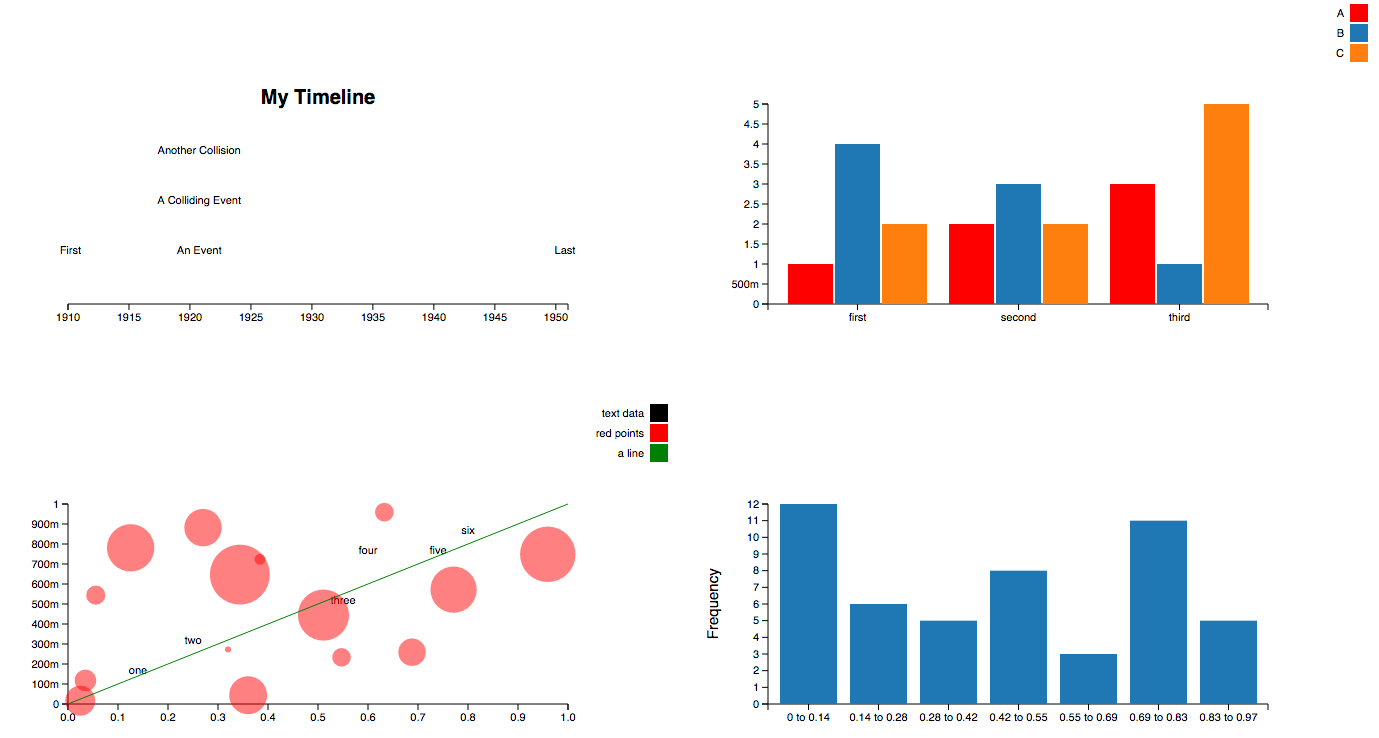
Timeline
pydex.timeline([
  { 'date': '1914-07-28', 'label': 'WW1' },
  { 'date': '1939', 'label': 'WW2' },
  { 'date': '1950-01-01', 'label': 'The Fifties'},
  { 'date': '1950-01-01', 'label': 'A Date Collision'},
])
Bar Chart
pydex.bar({
  'labels': ["A", "B", "C"],
  'groups': ["first", "second", "third"],
  'datasets': [
    {
      'values': [1, 2, 3],
      'color': 'red'
    },
    {
      'values': [4, 3, 1],
      'color': 'blue'
    },
    {
      'values': [2, 2, 5],
    }
  ]
})
Configuration
pydex.configure({
  'height': 500,
  'width': 700,
  'title': 'My First Chart',
  'xLab': 'x-axis label',
  'yLab': 'y-axis label'
})

 146 Nov 12, 2022
 17.1k Dec 31, 2022
 45 Jul 31, 2022
 10 Oct 27, 2021
 2.5k Dec 28, 2022
 1 Dec 21, 2021
 1.2k Dec 30, 2022
 5 Apr 29, 2022
 4 May 18, 2022
 207 Jan 01, 2023
 3 Oct 07, 2022
 1.9k Jan 02, 2023
 146 Sep 25, 2022
 675 Dec 09, 2022
 5.1k Dec 27, 2022
 973 Jan 09, 2023
 69 Dec 15, 2022
 9 Sep 19, 2022
 3.4k Jan 06, 2023
 190 Dec 13, 2022