bsc_trade_history
Make your BSC transaction simple.
Background:
inspired by debank ,Practice my hands on this small project
Blog:Crypto-BscTradeHistory Project
Online Demo:
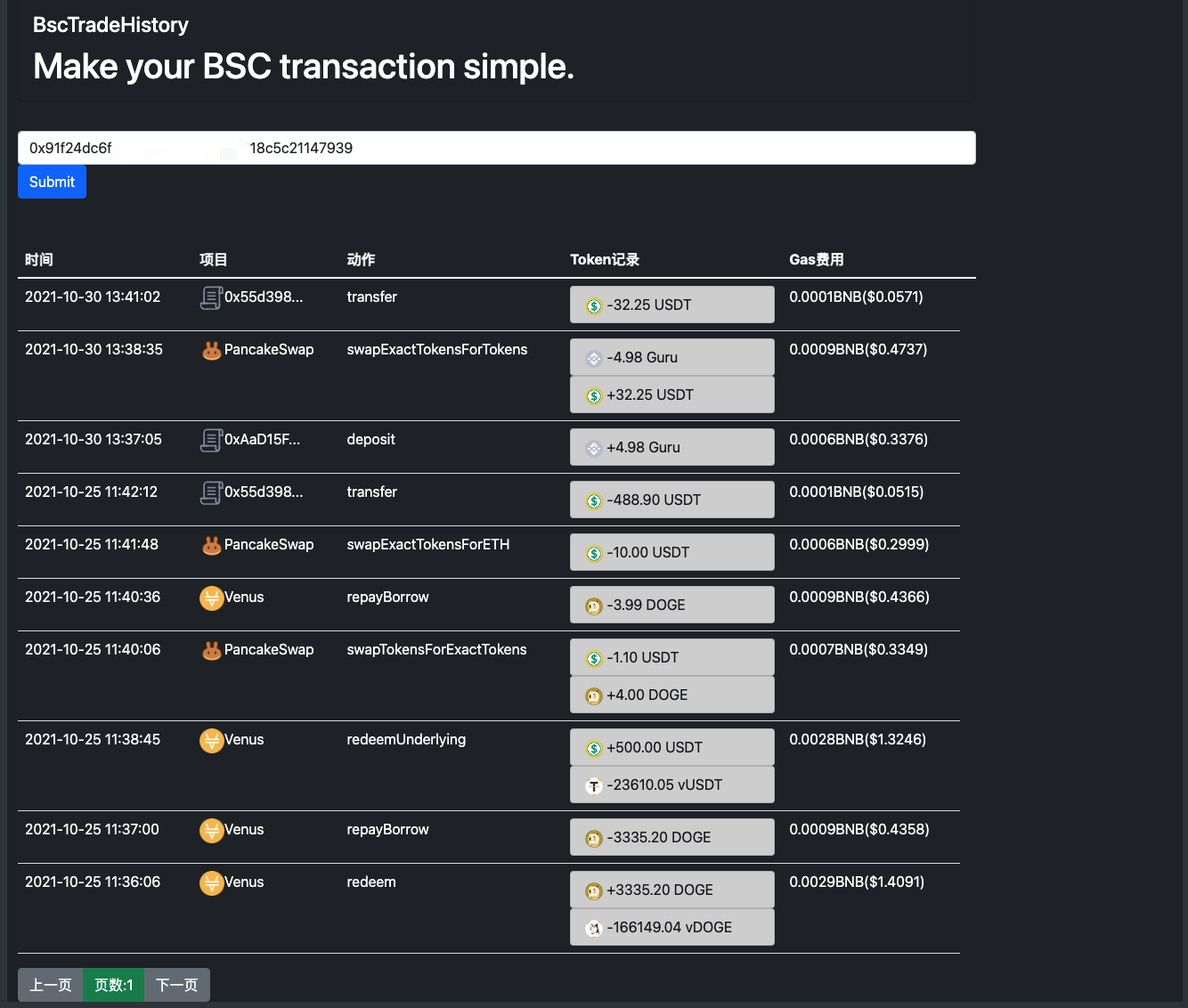
Snapshot:
Install-Web
# install
npm install -g @vue/cli
npm install axios --save
npm install bootstrap --save
npm install bootstrap-vue --save
# enter web project directory
cd client
# run Web
npm run serve
Install-Api
# enter web project directory
cd server
# install pyproject.toml required package
poetry install
# enter your bscscan apikey
vim config.py
# run Api
poetry run python app.py
Usage
visit http://YourIp:8080/history

 11 Oct 28, 2021
 9 Apr 02, 2022
 16 Nov 03, 2022
 5 Nov 22, 2022
 611 Dec 29, 2022
 2 Feb 17, 2022
 3 Oct 10, 2022
 1 Oct 15, 2022
 590 Dec 31, 2022
 14 Dec 21, 2022
 1 Nov 17, 2021
 5 Jan 02, 2022
 98 Dec 27, 2022
 1.7k Jan 04, 2023
 3 Feb 17, 2022
 6 Feb 07, 2022
 13 Dec 15, 2022
 13 Jul 16, 2022
 4 Oct 08, 2021
 148 Dec 19, 2022