Python ts2vg package provides high-performance algorithm implementations to build visibility graphs from time series data.

Overview

ts2vg: Time series to visibility graphs

pypi pyversions wheel license

Example plot of a visibility graph


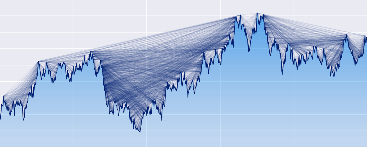
The Python ts2vg package provides high-performance algorithm implementations to build visibility graphs from time series data.

The visibility graphs and some of their properties (e.g. degree distributions) are computed quickly and efficiently, even for time series with millions of observations thanks to the use of NumPy and a custom C backend (via Cython) developed for the visibility algorithms.

The visibility graphs are provided according to the mathematical definitions described in:

  • Lucas Lacasa et al., "From time series to complex networks: The visibility graph", 2008.
  • Lucas Lacasa et al., "Horizontal visibility graphs: exact results for random time series", 2009.

An efficient divide-and-conquer algorithm is used to compute the graphs, as described in:

  • Xin Lan et al., "Fast transformation from time series to visibility graphs", 2015.

Installation

The latest released ts2vg version is available at the Python Package Index (PyPI) and can be easily installed by running:

pip install ts2vg

For other advanced uses, to build ts2vg from source Cython is required.

Basic usage

Visibility graph

Building visibility graphs from time series is very simple:

from ts2vg import NaturalVG

ts = [1.0, 0.5, 0.3, 0.7, 1.0, 0.5, 0.3, 0.8]

g = NaturalVG()
g.build(ts)

edges = g.edges

The time series passed can be a list, a tuple, or a numpy 1D array.

Horizontal visibility graph

We can also obtain horizontal visibility graphs in a very similar way:

from ts2vg import HorizontalVG

ts = [1.0, 0.5, 0.3, 0.7, 1.0, 0.5, 0.3, 0.8]

g = HorizontalVG()
g.build(ts)

edges = g.edges

Degree distribution

If we are only interested in the degree distribution of the visibility graph we can pass only_degrees=True to the build method. This will be more efficient in time and memory than computing the whole graph.

g = NaturalVG()
g.build(ts, only_degrees=True)

ks, ps = g.degree_distribution

Directed visibility graph

g = NaturalVG(directed='left_to_right')
g.build(ts)

Weighted visibility graph

g = NaturalVG(weighted='distance')
g.build(ts)

For more information and options see: Examples and API Reference.

Interoperability with other libraries

The graphs obtained can be easily converted to graph objects from other common Python graph libraries such as igraph, NetworkX and SNAP for further analysis.

The following methods are provided:

  • as_igraph()
  • as_networkx()
  • as_snap()

For example:

g = NaturalVG()
g.build(ts)

nx_g = g.as_networkx()

Command line interface

ts2vg can also be used as a command line program directly from the console:

ts2vg ./timeseries.txt -o out.edg

For more help and a list of options run:

ts2vg --help

Contributing

ts2vg can be found on GitHub. Pull requests and issue reports are welcome.

License

ts2vg is licensed under the terms of the MIT License.

You might also like...
The Spectral Diagram (SD) is a new tool for the comparison of time series in the frequency domain

The Spectral Diagram (SD) is a new tool for the comparison of time series in the frequency domain. The SD provides a novel way to display the coherence function, power, amplitude, phase, and skill score of discrete frequencies of two time series. Each SD summarises these quantities in a single plot for multiple targeted frequencies.

The windML framework provides an easy-to-use access to wind data sources within the Python world, building upon numpy, scipy, sklearn, and matplotlib. Renewable Wind Energy, Forecasting, Prediction

windml Build status : The importance of wind in smart grids with a large number of renewable energy resources is increasing. With the growing infrastr

Kglab - an abstraction layer in Python for building knowledge graphs

Graph Data Science: an abstraction layer in Python for building knowledge graphs, integrated with popular graph libraries – atop Pandas, RDFlib, pySHACL, RAPIDS, NetworkX, iGraph, PyVis, pslpython, pyarrow, etc.

Extensible, parallel implementations of t-SNE

openTSNE openTSNE is a modular Python implementation of t-Distributed Stochasitc Neighbor Embedding (t-SNE) [1], a popular dimensionality-reduction al

Extensible, parallel implementations of t-SNE

openTSNE openTSNE is a modular Python implementation of t-Distributed Stochasitc Neighbor Embedding (t-SNE) [1], a popular dimensionality-reduction al

Graphical display tools, to help students debug their class implementations in the Carcassonne family of projects

carcassonne_tools Graphical display tools, to help students debug their class implementations in the Carcassonne family of projects NOTE NOTE NOTE The

Draw interactive NetworkX graphs with Altair

nx_altair Draw NetworkX graphs with Altair nx_altair offers a similar draw API to NetworkX but returns Altair Charts instead. If you'd like to contrib

Draw interactive NetworkX graphs with Altair

nx_altair Draw NetworkX graphs with Altair nx_altair offers a similar draw API to NetworkX but returns Altair Charts instead. If you'd like to contrib

Generate graphs with NetworkX, natively visualize with D3.js and pywebview

webview_d3 This is some PoC code to render graphs created with NetworkX natively using D3.js and pywebview. The main benifit of this approac

Comments
  • help getting started

    help getting started

    I am playing around with ts2vg and I am having a hard time with the plotting using igraph. I try to compute the natural vg for a short time series, but when trying to plot it I get this error:

    Traceback (most recent call last):
      File "\anaconda3\envs\DK_01\lib\site-packages\IPython\core\interactiveshell.py", line 3398, in run_code
        exec(code_obj, self.user_global_ns, self.user_ns)
      File "<ipython-input-1-9a1fdcf342e8>", line 1, in <cell line: 1>
        ig.plot(nx_g, target='graph.pdf')
      File "\anaconda3\envs\DK_01\lib\site-packages\igraph\drawing\__init__.py", line 512, in plot
        result.save()
      File "\anaconda3\envs\DK_01\lib\site-packages\igraph\drawing\__init__.py", line 309, in save
        self._ctx.show_page()
    igraph.drawing.cairo.MemoryError: out of memory
    

    The file created is corrupted.

    Here is my code:

    import numpy as np
    from ts2vg import NaturalVG
    import igraph as ig
    
    import matplotlib.pyplot as plt
    
    # time domain
    t = np.linspace(1, 40)
    dt = np.diff(t)
    
    # build series
    x1 = np.sin(2*np.pi/10*t)
    x2 = np.sin(2*np.pi/15*t)
    
    y = x1 + x2
    
    plt.plot(t, y, '.-')
    plt.show()
    
    # build HVG
    g = NaturalVG()
    g.build(y)
    
    nx_g = g.as_igraph()
    
    # plotting
    ig.plot(nx_g, target='graph.pdf')
    

    I am using ts2vg 1.0.0, igraph 0.9.11, and pycairo 1.21.0

    opened by ACatAC 1
Releases(v1.0.0)
Make visual music sheets for thatskygame (graphical representations of the Sky keyboard)

sky-python-music-sheet-maker This program lets you make visual music sheets for Sky: Children of the Light. It will ask you a few questions, and does

21 Aug 26, 2022
With Holoviews, your data visualizes itself.

HoloViews Stop plotting your data - annotate your data and let it visualize itself. HoloViews is an open-source Python library designed to make data a

HoloViz 2.3k Jan 04, 2023
This is a super simple visualization toolbox (script) for transformer attention visualization ✌

Trans_attention_vis This is a super simple visualization toolbox (script) for transformer attention visualization ✌ 1. How to prepare your attention m

Mingyu Wang 3 Jul 09, 2022
Area-weighted venn-diagrams for Python/matplotlib

Venn diagram plotting routines for Python/Matplotlib Routines for plotting area-weighted two- and three-circle venn diagrams. Installation The simples

Konstantin Tretyakov 400 Dec 31, 2022
flask extension for integration with the awesome pydantic package

Flask-Pydantic Flask extension for integration of the awesome pydantic package with Flask. Installation python3 -m pip install Flask-Pydantic Basics v

249 Jan 06, 2023
Learning Convolutional Neural Networks with Interactive Visualization.

CNN Explainer An interactive visualization system designed to help non-experts learn about Convolutional Neural Networks (CNNs) For more information,

Polo Club of Data Science 6.3k Jan 01, 2023
Visualization Library

CamViz Overview // Installation // Demos // License Overview CamViz is a visualization library developed by the TRI-ML team with the goal of providing

Toyota Research Institute - Machine Learning 67 Nov 24, 2022
Functions for easily making publication-quality figures with matplotlib.

Data-viz utils 📈 Functions for data visualization in matplotlib 📚 API Can be installed using pip install dvu and then imported with import dvu. You

Chandan Singh 16 Sep 15, 2022
A programming language built on top of Python to easily allow Swahili speakers to get started with programming without ever knowing English

pyswahili A programming language built over Python to easily allow swahili speakers to get started with programming without ever knowing english pyswa

Jordan Kalebu 72 Dec 15, 2022
Bar Chart of the number of Senators from each party who are up for election in the next three General Elections

Congress-Analysis Bar Chart of the number of Senators from each party who are up for election in the next three General Elections This bar chart shows

11 Oct 26, 2021
A curated list of awesome Dash (plotly) resources

Awesome Dash A curated list of awesome Dash (plotly) resources Dash is a productive Python framework for building web applications. Written on top of

Luke Singham 1.7k Dec 26, 2022
Because trello only have payed options to generate a RunUp chart, this solves that!

Trello Runup Chart Generator The basic concept of the project is that Corello is pay-to-use and want to use Trello To-Do/Doing/Done automation with gi

Rômulo Schiavon 1 Dec 21, 2021
Draw tree diagrams from indented text input

Draw tree diagrams This repository contains two very different scripts to produce hierarchical tree diagrams like this one: $ ./classtree.py collectio

Luciano Ramalho 8 Dec 14, 2022
A simple interpreted language for creating basic mathematical graphs.

graphr Introduction graphr is a small language written to create basic mathematical graphs. It is an interpreted language written in python and essent

2 Dec 26, 2021
Productivity Tools for Plotly + Pandas

Cufflinks This library binds the power of plotly with the flexibility of pandas for easy plotting. This library is available on https://github.com/san

Jorge Santos 2.7k Dec 30, 2022
Parallel t-SNE implementation with Python and Torch wrappers.

Multicore t-SNE This is a multicore modification of Barnes-Hut t-SNE by L. Van der Maaten with python and Torch CFFI-based wrappers. This code also wo

Dmitry Ulyanov 1.7k Jan 09, 2023
Python module for drawing and rendering beautiful atoms and molecules using Blender.

Batoms is a Python package for editing and rendering atoms and molecules objects using blender. A Python interface that allows for automating workflows.

Xing Wang 1 Jul 06, 2022
YOPO is an interactive dashboard which generates various standard plots.

YOPO is an interactive dashboard which generates various standard plots.you can create various graphs and charts with a click of a button. This tool uses Dash and Flask in backend.

ADARSH C 38 Dec 20, 2022
Automatically visualize your pandas dataframe via a single print! 📊 💡

A Python API for Intelligent Visual Discovery Lux is a Python library that facilitate fast and easy data exploration by automating the visualization a

Lux 4.3k Dec 28, 2022
clock_plot provides a simple way to visualize timeseries data, mapping 24 hours onto the 360 degrees of a polar plot

clock_plot clock_plot provides a simple way to visualize timeseries data mapping 24 hours onto the 360 degrees of a polar plot. For usage, please see

12 Aug 24, 2022