sci palettes for matplotlib/seaborn
Installation
python3 -m pip install sci-palettes
Usage
import seaborn as sns
import matplotlib.pyplot as plt
import sci_palettes


print(sci_palettes.PALETTES.keys())

sci_palettes.register_cmap()          # register all palettes
sci_palettes.register_cmap('aaas')    # register a special palette

# methods for setting palette
plt.set_cmap('aaas')
plt.style.use('aaas')
sns.set_theme(palette='aaas')
sns.set_palette('aaas')

sns.scatterplot(...)

# set palette when plotting
sns.scatterplot(..., palette='aaas')
Full examples in examples
Gallery
展开查看
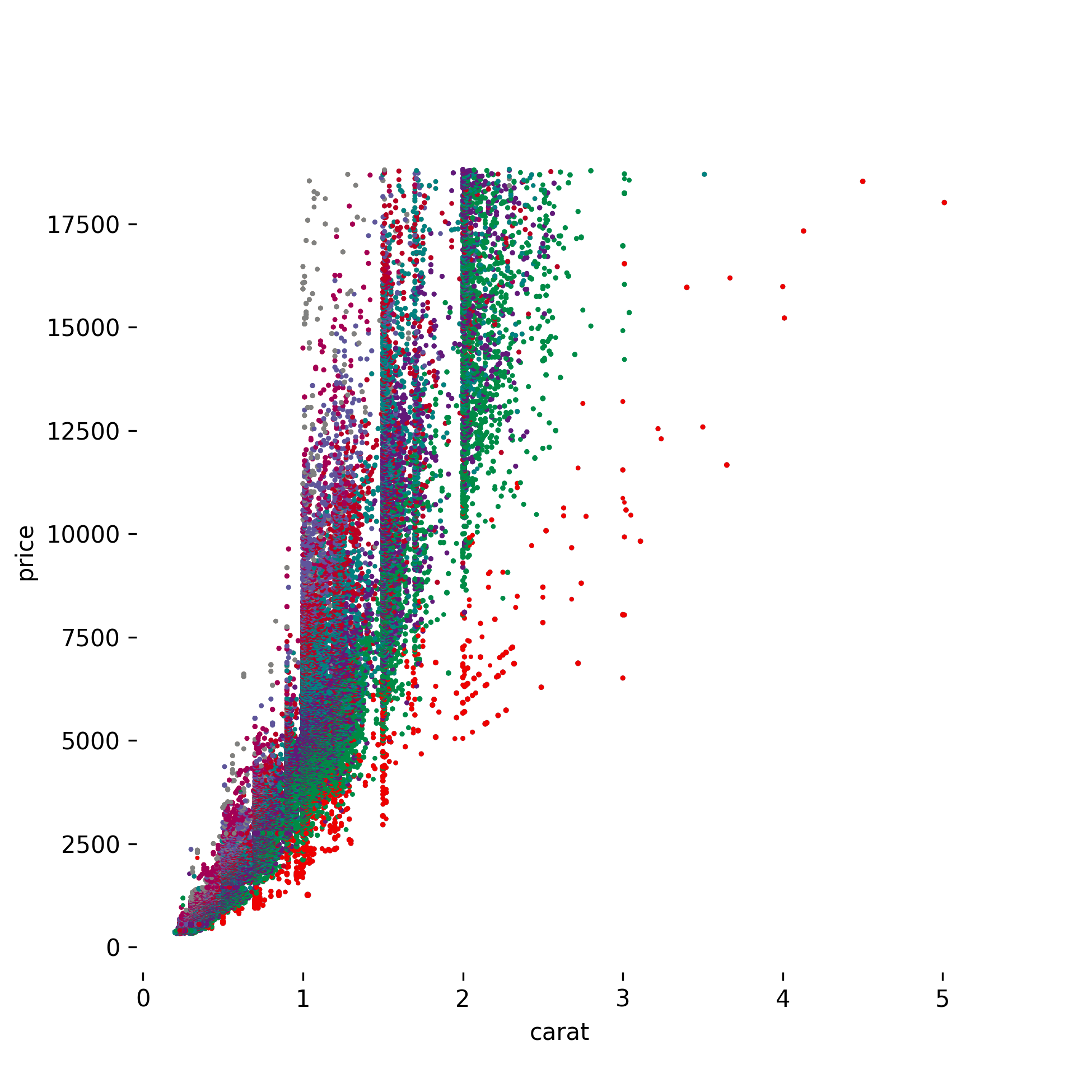
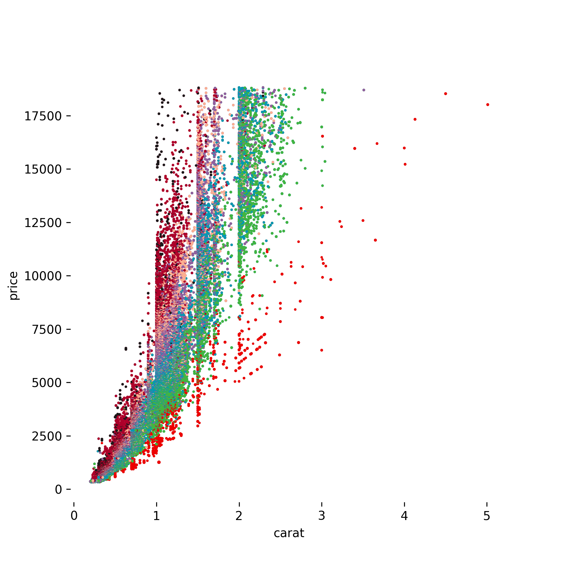
AAAS
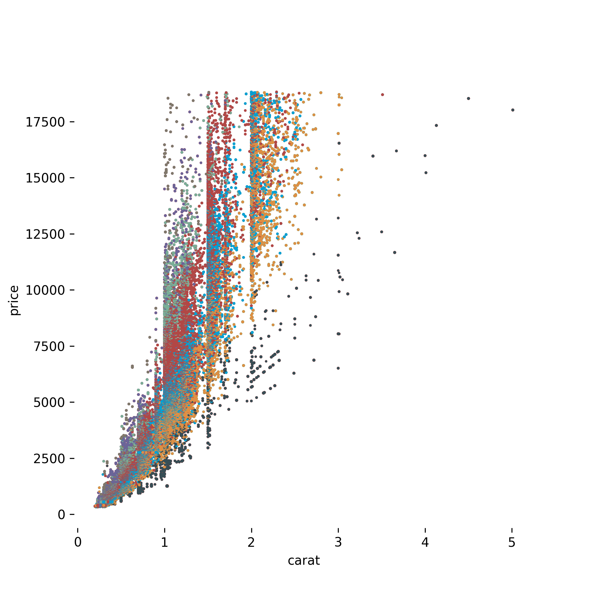
JAMA
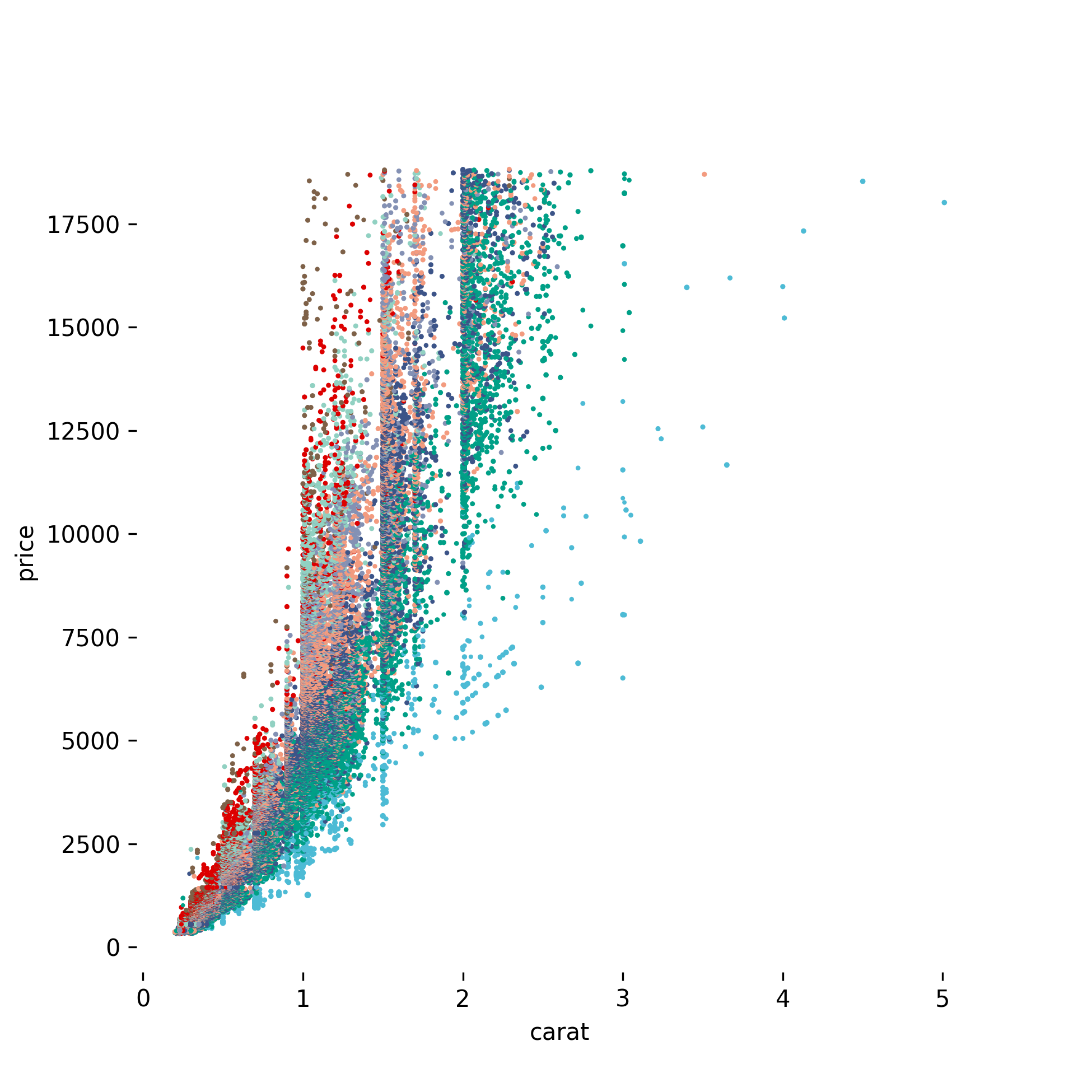
NPG
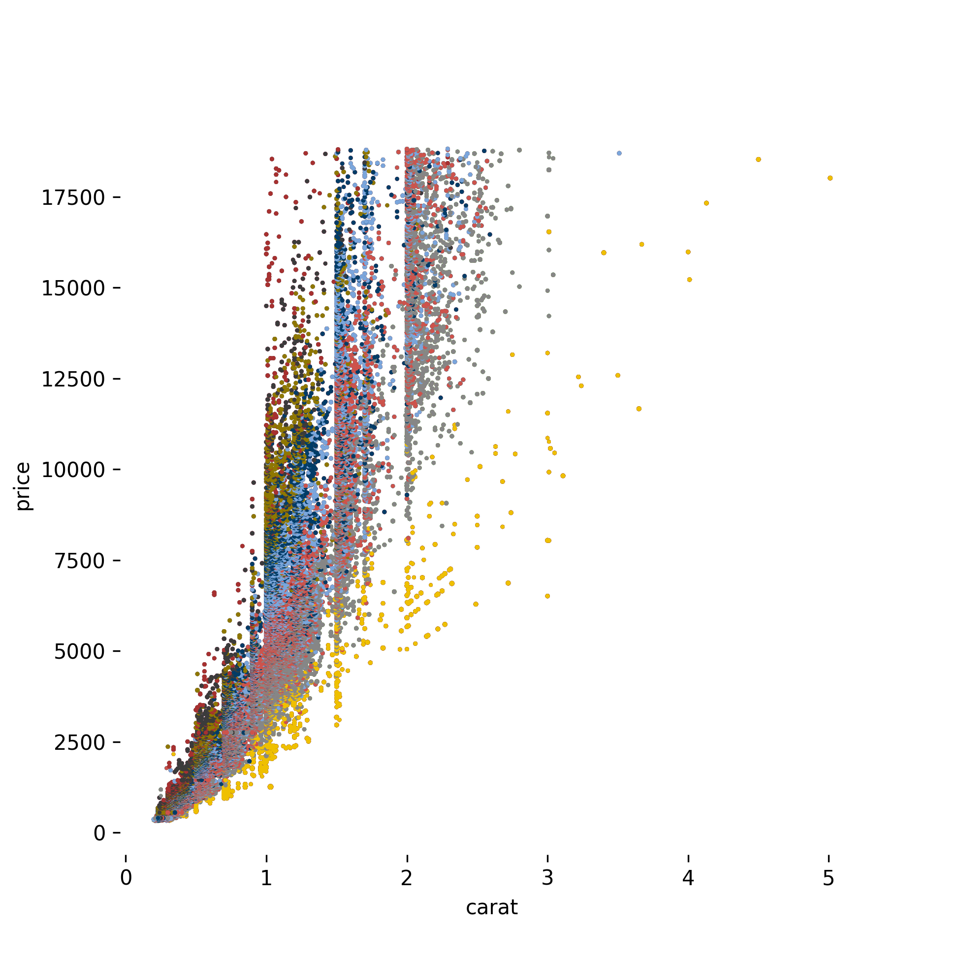
JCO
LANCET

 0 Jun 12, 2021
 5 Feb 16, 2022
 528 Jan 02, 2023
 27.5k Dec 30, 2022
 3 May 06, 2022
 190 Dec 13, 2022
 166 Dec 01, 2022
 4 Aug 14, 2022
 156 Jan 03, 2023
 1.3k Dec 13, 2022
 5 Nov 18, 2022
 1 Mar 10, 2022
 6.3k Jan 01, 2023
 8 Jun 22, 2022
 675 Dec 09, 2022
 3 Sep 10, 2022
 105 Dec 15, 2022
 2 Nov 15, 2021
 1.3k Jan 02, 2023
 1 Dec 30, 2021